
Online Business Directory
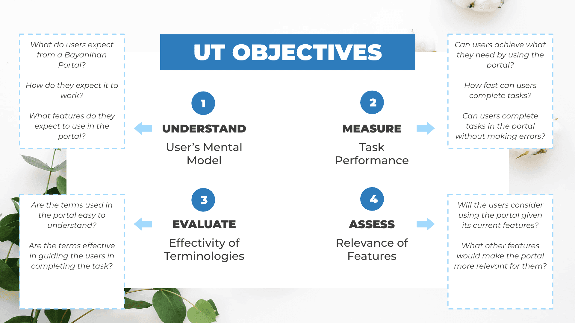
There was already an existing design for the map-based directory when I was tapped by the project team. The main goal was to evaluate the usability of the existing design and also evaluate the concept of a "Bayanihan Portal" to support businesses during these difficult times. To do this, I proposed a flexible method of conducting a hybrid usability with a touch of concept testing to understand user expectations for the portal.

2020
Lead UX Researcher
Evaluative UXR
The Problem / Opportunity
How to enhance the design of a map-based online business directory and provide support to businesses affected by the lockdown period in the Philippines due to Covid 19
Approach
Given the goals of the project team, I proposed a Hybrid Usability Testing
+ Concept Testing to gather user expectations for a Bayanihan Portal for MSMEs
Remote Moderated 1-1 user interviews
Major Insights
At its current state, the design was perceived as not useful given the critical task errors when using the directory to search for suppliers (e.g. no useful results when searching). Business owners would instead resort to using their current options when searching for suppliers and reaching more customers. Experience was also affected by the “plain” design which they consider “text-heavy”. Users were also not keen on having a big map occupying almost the entire page when searching.
But participants see potential in what the website can offer.
“It's more than just a directory.”
Prior to showing the design, MSME owners were expecting the “Bayanihan Portal” to be informative, engaging, and supportive to their business needs. But upon trying out the website, it fell short in delivering these basic expectations. MSME Owners were looking forward to specific improvements in the website, which can make the experience more relevant for them. (List confidential)
Impact
Update as of 2024: Unfortunately, the site is no longer existing. This project was an initiative to help businesses during the onset of pandemic, to provide an online directory of businesses that are still open.
Nonetheless, the results were able to help the Project Team know which ones to prioritize and iterate. Example:
Terminologies used:
Wordings on the landing page to guide first time users
Tutorial for first time users of the website
Providing Feedback
Letting users know the errors when filling out forms
Placing of buttons and icons
Making the “List View” and “Dashboard to Map view” icon more noticeable
Placing “Submit Button” at the bottom page, following flow of filling out forms
Key Learnings
This project is one of those examples when a product or design was already created prior to understanding what users really need. But UX Researchers shouldn't feel bad about this. Instead, we should just do whatever can be done at whatever stage the product is, and gather insights that can still guide the next design iterations.